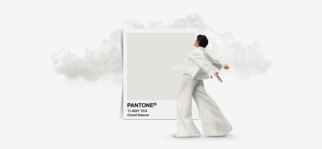
When Pantone announced Cloud Dancer as its Color of the Year 2026, the industry paused for a moment, partly in surprise, partly in recognition. The choice of an aerated, creamy white breaks with the bold hues that have dominated recent cycles, landing instead on a shade that barely calls attention to itself. Yet precisely because it is so quiet, Cloud Dancer arrives with a provocative message about where design, branding, and cultural expression are heading. In a period shaped by overstimulation, digital exhaustion, and the pressure to stand out in algorithmic feeds, Pantone has crowned the color of calm, inviting creatives to rethink what visibility means in a world fluent in noise.
A New Aesthetic Language Built on Subtraction
Cloud Dancer is less a color than an atmosphere. It evokes clarity, reflection, and the emotional exhale that follows years of chaotic visual culture. After Peach Fuzz celebrated tenderness in 2024 and Mocha Mousse grounded 2025 in earthy warmth, the move toward white feels symbolic, basically a collective reset. This shift mirrors broader consumer desires for mental spaciousness and environments that feel less crowded and more intentional. Rather than commanding attention, Cloud Dancer dissolves into the background, becoming the structural foundation upon which brands can rebuild meaning.
In practice, the hue operates as design infrastructure. It elevates negative space, softens interfaces, and allows products, typography, and motion elements to become the protagonists. It also legitimizes the “calm commerce” movement already rising across wellness, productivity, fintech, beauty, and tech. In these sectors, serenity is not an aesthetic preference; it is a brand promise. Cloud Dancer amplifies it by turning simplicity into a strategic asset.
A Color That Demands Storytelling, Not Dependence
Because Cloud Dancer offers minimal visual excitement, its power lies in the narratives brands construct around it. White can symbolize sanctuary, renewal, minimalism, precision, or purity, yet none of these meanings appear automatically. Successful campaigns will need to clarify what this white stands for, whether it is the blank page before creativity, the controlled sterility of science and innovation, or the gentle quiet of ritual and self-care.
This necessity for storytelling explains why early brand collaborations lean heavily on contrast and texture. Motorola’s special-edition phone pairs the muted hue with reflective crystals to reintroduce drama. Beauty brands are pushing milky shades toward gloss, translucency, and cloud-like finishes that feel tactile rather than flat. Interiors and hospitality players are layering whites through ceramics, linen, candles, and soft florals, creating dimensional experiences instead of sterile minimalism.
The Market Repercussions of a “Neutral” That Isn’t Neutral
Pantone’s choice also sparked unusual debate, exposing how even a color built on neutrality carries cultural weight. Critics argued that choosing white in a politically polarized environment risks symbolic misalignment. Others framed the decision as commercially safe: an aesthetic that has already dominated interiors, packaging, and tech for years. These conversations highlight an essential tension for marketers. While Cloud Dancer offers universality and longevity, qualities invaluable to global brands, it can also slide into sameness if used without intentional differentiation.
This risk is particularly relevant in feeds overflowing with beige, cream, and quiet luxury visuals. In the wrong hands, Cloud Dancer will accelerate visual fatigue. In the right hands, it becomes a strategic pause that makes bold accents, texture, typography, and motion feel more striking than they would against richer palettes. Its real power lies not in neutrality but in contrast.
What Cloud Dancer Means for Creative Strategy in 2026
The shift signals a new creative economy built not on maximalism but on clarity. Designers will treat Cloud Dancer as a system color, a base for data storytelling, editorial layouts, and brand worlds that emphasize readability and intention. Beauty and skincare campaigns will adopt soft whites to reinforce a clinical, trustworthy identity. Fashion will explore sculptural silhouettes and tonal layering, proving that restraint can still communicate luxury. Events and hospitality will turn Cloud Dancer into immersive environments where air, light, and texture create emotional resonance.
In digital marketing, the color may improve performance rather than dilute it. Whitespace-driven ads often increase readability, slow scrolling, and improve retention. A Cloud Dancer backdrop paired with minimal copy and a single strong focal point can outperform louder creatives; not because it demands attention, but because it gives consumers permission to give it.
The Creative Challenge Ahead
Pantone’s 2026 pick forces an essential question: how does a brand stand out when the trend itself is silent? The answer lies in constructing worlds rather than relying on color to do the heavy lifting. Cloud Dancer can anchor campaigns in calm, clarity, or renewal, but it needs contrast, narrative, and craftsmanship to become memorable. It is a color that rewards those who design with intention rather than decoration.
In a market increasingly defined by meaning rather than aesthetics alone, Cloud Dancer may be the most radical neutral Pantone has selected in years. It reflects a cultural desire for psychological breathing room while simultaneously demanding a stronger creative strategy. The irony is striking: by choosing a white, Pantone may have invited marketers to think more colorfully than ever.


