

In early 2025, Google made a move that might have gone unnoticed by the casual user, but it’s reverberating through the branding and design world: a subtle yet significant update to its iconic “G” logo. This is the first time in nearly a decade that the tech titan has touched its primary logo, a symbol instantly recognized across cultures and devices. But while the change may appear minimal, its implications are anything but.
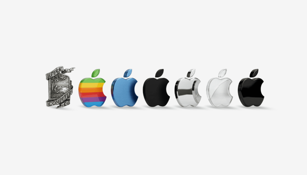
In September 2015, Google abandoned its serif font in favor of a cleaner, sans-serif style, signaling a shift towards accessibility and modernity. Now, nearly ten years later, that same evolution continues with a refined “G” logo—still composed of the unmistakable quartet of colors (blue, red, yellow, and green), but now reimagined with smoother curves, subtler proportions, and, most notably, a seamless gradient flow between hues.
Design That Whispers, Not Shouts
The rework doesn’t scream for attention. Instead, it’s a visual whisper—a sophisticated nod to the design ethos of the current era, where user experience, versatility, and elegance matter more than grandeur. The hard transitions between colors have been replaced by blended gradients, creating a sense of continuity and motion. It’s a small shift in appearance, but a deliberate one, crafting a logo that feels more organic on today’s diverse array of screens—from foldables and wearables to car dashboards and mixed-reality headsets.
The updated design is already gradually rolling out across Google’s ecosystem.
A Mirror of Google’s AI-Led Strategy
This logo refresh arrives not in isolation, but at a pivotal moment in Google’s broader strategic direction. The visual gradient aligns closely with Google’s Gemini branding—its flagship suite of AI tools and models—suggesting a deliberate cohesion between core services and AI-driven experiences. This is no coincidence. Rather, it’s a sign that Google is weaving artificial intelligence more tightly into the fabric of its identity.
Designing for consistency across platforms is key. From a marketing standpoint, this evolution accomplishes what the best brand updates do: it builds on existing trust while signaling progress. The refined ” G ” holds up for users in emerging markets with low-res devices or those engaging with ambient computing in high-tech environments, the refined “G” holds up. It ensures clarity and brand integrity everywhere it appears.
Trust, Continuity, and Subconscious Branding
Psychologically, such subtle visual refinements help cement continuity in users’ minds. The shape is new, but the soul is the same. This matters—especially now, as Google faces increased scrutiny around privacy, misinformation, and antitrust regulation. A familiar yet polished logo reassures users: “We’re evolving, but we’re still dependable.”
This branding philosophy taps into a deeper marketing truth—trust is not only built through policies or promises; it’s maintained visually, through the quiet consistency of the brand elements people see daily.
Future-Proofing Google’s Identity
What makes this logo shift especially intriguing is its timing. A decade is a long stretch for any tech company to keep its core mark unchanged. Now, Google’s choice to update its symbol sends a clear message: it’s not coasting on past recognition. It’s actively preparing for what comes next.
As Google moves deeper into ambient and generative technologies, its logo must comfortably live in a reality where screens are optional, input methods are multimodal, and the brand experience is fluid.
Internally, this shift also simplifies brand execution. With one unified logo system, Google’s design teams—from Search to Chrome to YouTube—can now align under a shared visual vocabulary. This not only accelerates design workflows but reinforces coherence in the user journey. Especially as AI reshapes interfaces and interactivity, having a consistent brand symbol across experiences becomes crucial.
The Art of Subtle Branding in a Loud World
Google’s updated “G” may not dominate headlines, but it’s a masterclass in modern brand stewardship. It demonstrates that at its best, branding doesn’t need to reinvent itself—it needs to resonate.
In a world where brands often chase attention with drastic reinventions, Google’s decision to evolve rather than overhaul speaks volumes. It’s a reminder that true brand power lies not in how loudly you announce change, but in how seamlessly that change fits into the lives of billions.