
The Survey That Changed Everything
In 2023, Lacoste conducted a brand perception survey that produced a result its leadership could not ignore. The majority of respondents recognized the brand immediately. Its crocodile emblem — one of the most globally recognized symbols in fashion, worn on chests across 120 countries — was known everywhere. But a significant portion of those same respondents were unaware that Lacoste is a French brand. The country of origin, which had been central to the brand’s identity since René Lacoste founded La Chemise Lacoste in 1933, had effectively disappeared from the brand’s legible identity in the minds of the people buying its products.
The survey also revealed a positioning problem that compounded the heritage one: Lacoste occupied an unclear space in consumers’ mental model, caught in the middle between professional sports apparel and runway fashion without fully committing to either. A brand that has existed for 93 years, with over 1,100 boutiques worldwide and one of the most distinctive visual symbols in the industry, had somehow managed to become uncertain about what it was — and that uncertainty had transferred to its customers.
What Heritage Actually Means in a Rebrand
The response Lacoste chose is worth examining in some detail, because it demonstrates a kind of discipline that is harder to execute than it sounds. Rather than commission a new visual language that would signal modernity by departing from the past, the brand did the opposite: it went back into its archives and found what had always been there, then brought it forward with greater clarity and conviction. The rebrand, developed in collaboration with Commission Studio, is not a reinvention. It is a reclamation.
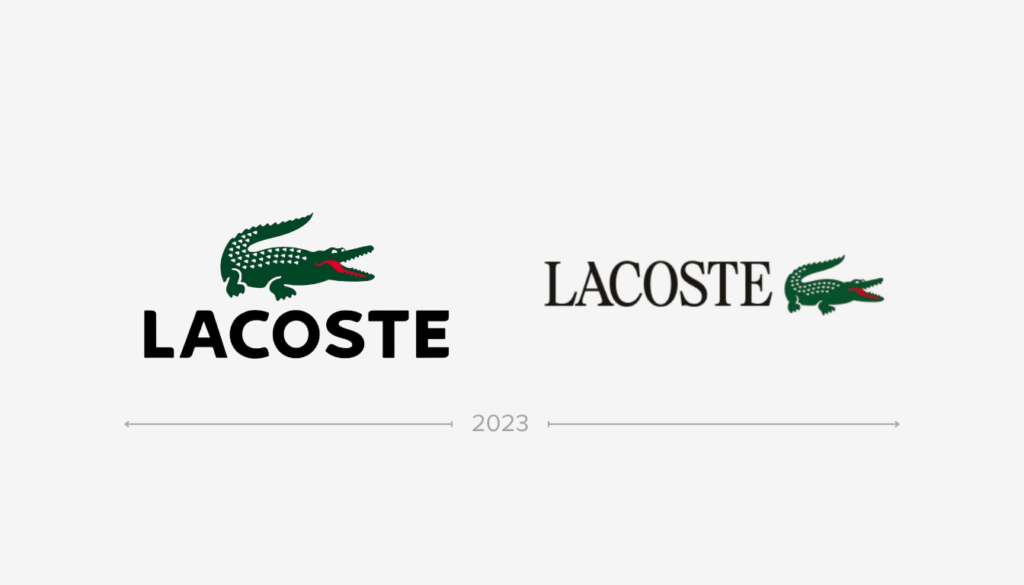
Typography is the most structurally significant change. The brand’s previous identity, in place since 2011, used a simple sans-serif wordmark — clean, contemporary, and thoroughly neutral. The new identity reintroduces serif characters drawn from Lacoste’s own archival expressions, designed as a bespoke typeface with what the brand describes as meticulous attention to proportion, rhythm, and spacing. The effect is immediately legible: this is a brand with history, with craft, with a specific origin. Sans-serif wordmarks read as timeless and generic because they have been adopted so widely. A distinctive, carefully designed serif carries time in it — it communicates that there was a before, and that the before matters.
The Crocodile itself has been revisited with a more considered approach to its application, allowing for greater prominence across brand expressions. The original illustration by Robert George, who created the first crocodile emblem, has been returned to as a reference point, sharpening the connection between the current visual identity and the 1933 founding moment. The color palette reasserts the brand’s historic green — in three of its emblematic shades — alongside clay, a reference to the tennis clay courts where René Lacoste built his sporting legend, and farine, an off-white that pays tribute to the blazer he was wearing when his nickname was coined.
The Crocodile Nickname and Why It Matters
The origin story of the Lacoste crocodile is itself a lesson in how heritage accrues meaning. René Lacoste was one of the finest tennis players of his era — nicknamed “the Crocodile” by American journalists after a celebrated episode in which he persisted relentlessly to win a bet on a crocodile-skin suitcase. He began embroidering a small crocodile on the breast of his tennis blazer. When he founded La Chemise Lacoste in 1933, the crocodile moved from his blazer to his shirts. It was, from the beginning, a brand mark rooted in a specific person’s specific story in a specific place — not a symbol invented in a marketing meeting but one that grew organically from biography.
That specificity is exactly what the Commission Studio rebrand is designed to recover and amplify. The French identity, the tennis heritage, the precise details of color and typography that locate the brand in a particular tradition of French elegance — these are not additions to the brand. They are the brand. The 2011 identity had allowed them to recede into generic readability, and the survey revealed the cost. The 2026 rebrand restores their prominence.
The Right Problem to Solve
What makes the Lacoste rebrand particularly worth studying is not the specific design decisions — which are, by most accounts, executed with considerable sophistication — but the quality of the problem diagnosis that preceded them. Many brands that undertake rebrands are responding to a vague sense of staleness or competitive pressure, and the result tends to be a set of changes that feel arbitrary because they were not derived from a specific understanding of what was wrong. Lacoste’s rebrand is different because it emerged from precise data: consumers recognized the brand but did not know it was French, and lacked a clear sense of where it stood in the market. Every decision in the Commission Studio identity can be traced back to those two findings.
The serif typography makes the brand’s French heritage legible in its visual language. The reassertion of tennis clay and René Lacoste’s personal history reconnects the brand to the specific sporting context that gives the crocodile its meaning. The more prominent application of the Crocodile across brand expressions addresses the positioning clarity problem by making the brand’s most distinctive asset more consistently present.
It is, in the vocabulary of brand management, a case of a company doing exactly what needed to be done after finding out exactly what was wrong, which is rarer than it sounds, and a considerably better outcome than what the survey could have produced had it been handled differently. Lacoste could have responded to a finding that consumers didn’t know it was French by commissioning a new visual identity that felt less French. Instead, it went in the other direction. The crocodile approves.