
A Small Change With a Very Loud Reception
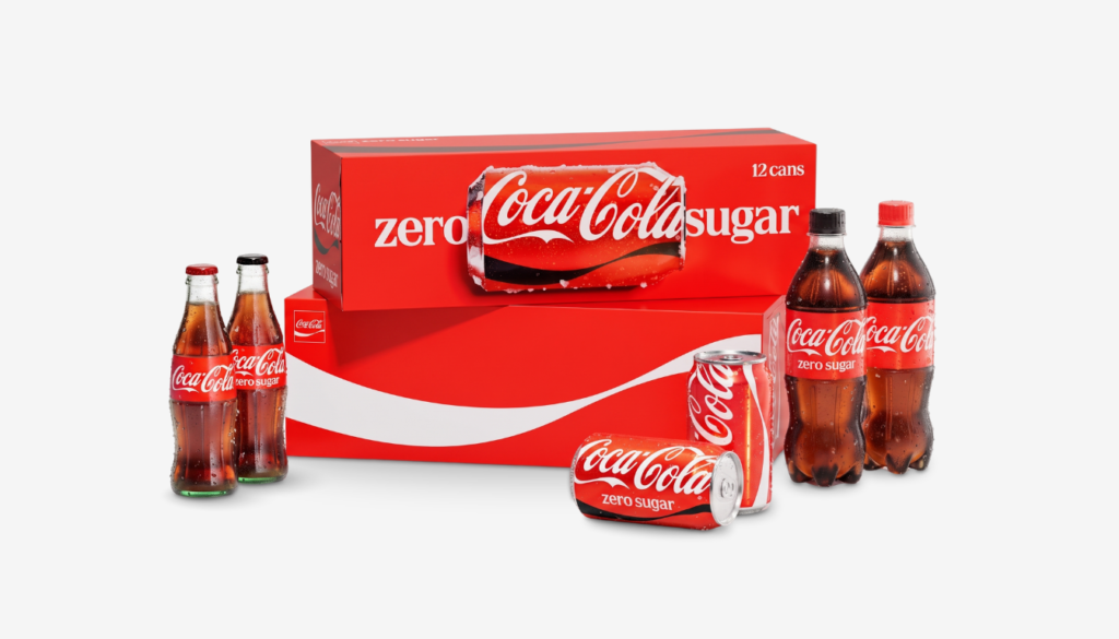
Coca-Cola unveiled a new global visual identity system on July 20, developed with the design agency JKR and rolling out across more than 200 markets. The famous Spencerian script was refined rather than replaced. The dynamic ribbon was adjusted. By the standards of legacy brand work, the changes were conservative, and the brief given to the agency was reportedly to make Coca-Cola more like itself.
Within days, none of that was the story. What consumers reacted to was a complementary slab serif called Better With, used for words such as Delicious and Refreshing across packaging and advertising. Rendered in red and white, it reminded a large number of people of a pack of Marlboro reds, and social platforms filled with the comparison. Coca-Cola did not respond to press questions about it, and JKR referred inquiries to the company.
The typefaces are not the same. Marlboro uses a proprietary font, and designers examining both have identified structural differences between them. That distinction did not survive contact with a phone screen, which is the part marketers should sit with.
The Same Typeface, Three Years Earlier
The most useful detail in the episode is chronological. Better With was drawn for Coca-Cola by Brody Associates in 2023 and used for holiday marketing at the time. It generated no meaningful reaction. Brand strategist Allen Adamson, cofounder of Metaforce, pointed out that when the font first appeared, nobody blinked.
What changed was not the letterforms. It was their status. A seasonal typeface used for a few weeks reads as a campaign decision. The same typeface installed at the center of a permanent identity system reads as a statement about who the brand is now. Consumers apply different scrutiny to the two, and brand teams routinely underestimate that difference when they promote an existing asset into a load-bearing role.
There is a practical lesson in it. Testing a design element in a limited campaign proves that it does not fail. It does not prove that it can carry an identity, because the audience was never asked to read it that way.
Possession Rather Than Preference
The temptation is to explain the backlash culturally, as evidence that sugary drinks have become a generational stand-in for tobacco. That reading is entertaining and mostly wrong. Specialists who examined the reaction traced it to something more durable, which is the psychological claim consumers make on brands they grew up with.
Sabrina Babooram, head of strategy at the Toronto agency Academy, noted that the font drew fire precisely because typography is a key identifier for a brand woven through generations of daily life. Adamson put the same idea more bluntly, describing Coke as “wallpaper in people’s lives” and observing that people notice when the wallpaper moves even slightly.
The pattern has a long record. Ikea provoked an outcry in 2009 when it abandoned Futura. Tropicana changed its carton and typeface the same year and reversed course under consumer pressure. Gap switched to Helvetica in 2010 and retreated within a week. Jaguar’s 2024 overhaul, which dropped the Optima typeface it had used for decades, drew commentary well outside the design press.
In each case the volume of the reaction tracked the depth of the relationship, not the size of the change. Brands nobody feels ownership over can be redesigned in silence.
The Audit Nobody Runs
The more actionable failure here is technical. Jon Arriaza, creative director at Chase Design Group, made the point that when a brand owns a strong color, designers carry an obligation to examine what other brands own that same color before committing to a new element inside it.
Red and white is not neutral territory. It is shared with a small number of globally recognized identities, and the combination of a bold slab serif with that palette narrows the field further. A comparative audit against category-adjacent and category-distant brands using the same color equity would have surfaced the Marlboro adjacency before launch. Most identity processes test legibility, scalability and internal preference. Few test collision.
That check costs a fraction of a global rollout across 200 markets. It is the cheapest insurance in the process and the one most often skipped, because the risk it protects against feels absurd until it happens.
What to Do When It Happens
Coca-Cola’s silence so far is defensible. Responding to a meme cycle tends to extend it, and identity systems are judged over years rather than news cycles. The Tropicana and Gap reversals are cautionary in both directions: they demonstrated that customers can force a rollback, and also that reversing under pressure converts a design problem into a leadership problem.
The more useful posture is to separate noise from damage. A joke that travels for a week costs a brand very little. An association that attaches permanently to the product in a category already facing regulatory pressure over sugar is a different exposure. Coca-Cola will know which one it has within a quarter, when the identity has been seen in shelf context rather than in screenshots.
For everyone else, the takeaway is cheaper to act on. Consumers do not experience a rebrand as a project. They experience it as something being done to a thing they consider partly theirs.